The voting is now open for MGOV's next logo, this will be done via public vote.
To vote please click on the tab at the bottom of the page.
Voting will close on Monday 17th May at 4pm.
To vote please click on the tab at the bottom of the page.
Voting will close on Monday 17th May at 4pm.
|
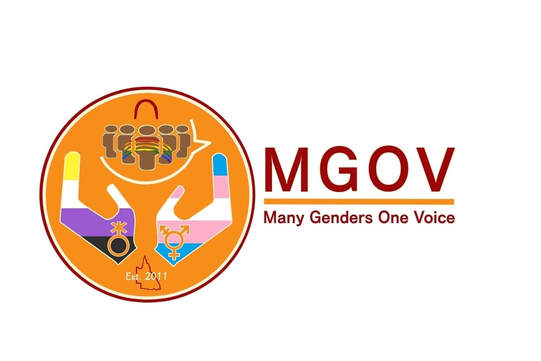
Logo B: The main colours I chose for the logo are dark red, and orange because they are both colours that represent MGOV's values, and goals.
Trans, Gender Diverse, and Non-Binary colours included - Leadership = dark red (associated with vigor, willpower, rage, anger, leadership, courage, longing, malice, and wrath. Social = orange (Social and inviting, this is the color of the extrovert, exuding happiness and joy, releasing inhibitions) Support = brown (natural color, associated with the earth and as a result giving a sense of stability and support) Volunteers = I have used hands to represent this element I included the founded in date of 2011, with the outline of Queensland. I used Gender neutral silhouettes in a group setting to represent the social and support group elements, using brown as the main colour. I included the gender symbols for Trans, and Non-Binary, and positioned them inside the hands. I wanted to represent the sistergirls and brotherboys, and chose to use two aboriginal symbols that are commonly used in aboriginal art. I used the inverted 'U' shaped curve which means person/human. It usually suggests a seated figure as the 'U' shape represents their imprint in the sand. I also chose to use the aboriginal rainbow symbol, as it could represent all individuals, and communities. I placed it inside the group of silhouettes, using the pride colours to fill the rainbow. |
|
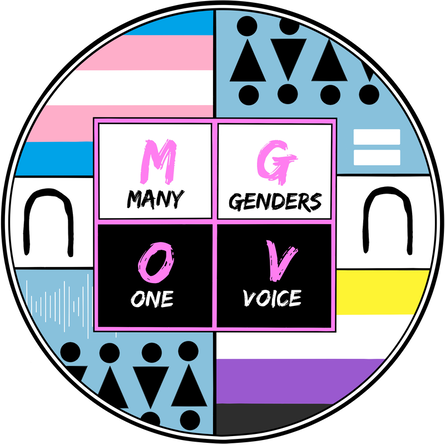
Logo C: A short explanation for the symbols I have chosen to use in the logo design, they are as follows; Gender neutral symbol on bottom left and top right, it represents all gender. Sound waves on bottom left represent voice/s, are easily identifiable, Equal '=' symbol on top right represents equality and is easily identifiable. 'U' or crescent shape symbol on middle, left and right side represents sistergirls and brotherboys. Its meaning is, 'people, both man and woman', used in Aboriginal Art, and can be found in many Aboriginal paintings. |
|
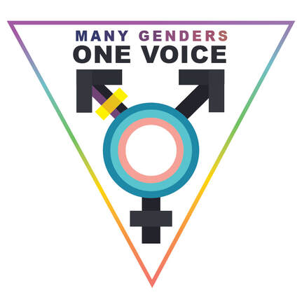
Logo D: I wanted to create a logo that immediately communicated what MGOV is about so I went with using the transgender symbol while also incorporating the transgender and nonbinary flag colours. I've used the pink triangle iconography but coloured rainbow as both a nod to LGBT history and as a symbol of unity. I've used a simple Arial font for accessibility reasons and used a gradient of blues, purples and pinks for the "many genders" text to represent the diversity of gender identities rather than a rigid blue and pink binary. |
|
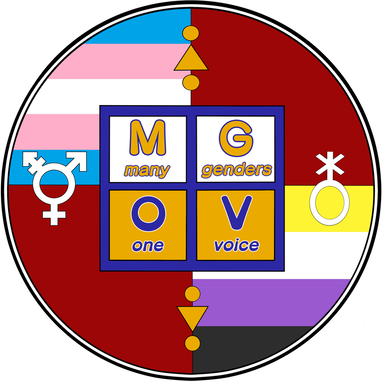
Logo E: Short explanation why I choose the symbols used in this design, they are as follows; Gender neutral symbol centred top and bottom which represents all genders, well known symbol, easily identifiable, Transgender symbol centred on the left side to represent transgender, well known symbol, easily identifiable, Non-binary gender symbol centred on right side which represents non-binary, well known symbol, easily identifiable. The colour palette for this design is inspired by vintage pop art, which is my favourite style of art for so many reasons, but mostly for its unique, eye catching, simple and bold designs. It incorporated the united colours of diversity and the circle representing support and inclusion |
|
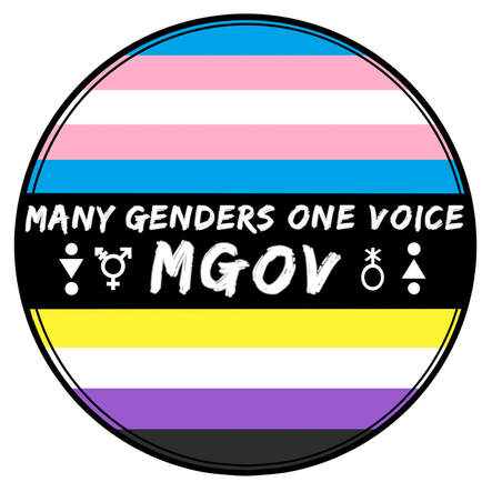
Logo F: have used the trans, gender diverse and non-binary colours in all of my designs. In this design the Trans colours - top of logo, and gender diverse and non-binary colours - boI will provide a short explanation for each element and why I chose it for this design, they are as follows; Gender neutral symbol (either side of MGOV acronym) - to represent all genders, well known symbol, easily identifiable, Transgender symbol (left side of MGOV acronym) - to represent transgender, well known symbol, easily identifiable, Non-binary gender symbol (right side of MGOV acronym) - to represent non-binary, well known symbol, easily identifiable Name of group - Many Genders One Voice - MGOV. I have gone with a more simplistic design choice for this logo. Its easy to read, less is more kind of approach and the only colours I have used for this design represent trans, gender diverse and non-binary individuals and communities
|
